Difference between revisions of "RxLayoutContainer"
From Ribbon Commander Documentation
| Line 15: | Line 15: | ||
{{DocTableEntry | name=isEmpty}} | {{DocTableEntry | name=isEmpty}} | ||
{{DocTableEntry | name=isLive}} | {{DocTableEntry | name=isLive}} | ||
| + | {{DocTableEntry | name=layoutChildren}} | ||
{{DocTableEntry | name=parent}} | {{DocTableEntry | name=parent}} | ||
{{DocTableEntry | name=tag}} | {{DocTableEntry | name=tag}} | ||
| Line 31: | Line 32: | ||
{{DocTableColEntry | controlName=rxLayoutContainer| propName=imageControls}} | {{DocTableColEntry | controlName=rxLayoutContainer| propName=imageControls}} | ||
{{DocTableColEntry | controlName=rxLayoutContainer| propName=labelControls}} | {{DocTableColEntry | controlName=rxLayoutContainer| propName=labelControls}} | ||
| − | |||
{{DocTableColEntry | controlName=rxLayoutContainer| propName=layoutContainers}} | {{DocTableColEntry | controlName=rxLayoutContainer| propName=layoutContainers}} | ||
{{DocTableColEntry | controlName=rxLayoutContainer| propName=radioGroups}} | {{DocTableColEntry | controlName=rxLayoutContainer| propName=radioGroups}} | ||
Latest revision as of 02:56, 13 March 2013

Contents
Description
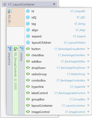
rxLayoutContainer models element CT_LayoutContainer of the MS Custom UI XML specification which specifies a grouping container control that aligns child controls horizontally or vertically.
Properties
Property Name
|
Description
|
| align | Specifies where child controls are aligned within a container control |
| expand | Specifies the directions in which the control expands to fill its parent container. |
| id | The ID of a custom UI element. IDs must be unique |
| idQ | A qualified control ID. Qualified IDs allow different add-ins to modify the same custom group, tab, or menu |
| isEmpty | Read-only property; returns true if the control is empty |
| isLive | Read-only property; returns true if the control is live |
| layoutChildren | Specifies the direction that child controls are laid out within a container control |
| parent | The control's parent object |
| tag | Custom data |
| xml | Returns the xml node that corresponds to the state of the control |
Contained Controls
Property Name
|
Description
|
| buttons | A collection of buttons |
| checkBoxes | A collection of check boxes |
| comboBoxes | A collection of combo boxes |
| dropDowns | A collection of drop-downs |
| editBoxes | A collection of edit boxes |
| groupBoxes | A collection of group boxes |
| hyperlinks | A collection of hyperlinks |
| imageControls | A collection of image controls |
| labelControls | A collection of label controls |
| layoutContainers | A collection of layout containers |
| radioGroups | A collection of radio group controls |
| ribbonXControls | The collection of all contained ribbonX controls |
Methods
Method Name
|
Description
|
| clear | Clears the control's state |
| clone | Creates a clone of the control (a new id is automatically created if applicable) |
| readXml | Populates the control using the passed-in XML string |
Delegates
Delegate Name
|
Description
|
Events
Event Name
|
Description
|