Difference between revisions of "RxRadioGroup"
From Ribbon Commander Documentation
(→Delegates) |
|||
| Line 41: | Line 41: | ||
{{DocTableBegin | Col1Name=Delegate Name | Col2Name=Description}} | {{DocTableBegin | Col1Name=Delegate Name | Col2Name=Description}} | ||
{{DocTableEntry | name=getEnabled}} | {{DocTableEntry | name=getEnabled}} | ||
| + | {{DocTableEntry | name=getItemCount}} | ||
| + | {{DocTableEntry | name=getItemID}} | ||
| + | {{DocTableEntry | name=getItemLabel}} | ||
{{DocTableEntry | name=getKeytip}} | {{DocTableEntry | name=getKeytip}} | ||
{{DocTableEntry | name=getLabel}} | {{DocTableEntry | name=getLabel}} | ||
Latest revision as of 14:58, 13 March 2013

Contents
Description
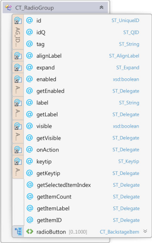
rxRadioGroup models element CT_RadioGroup of the MS Custom UI XML specification which specifies a group of radio buttons.
Properties
Property Name
|
Description
|
| alignLabel | Specifies the position where the controlâÂÂs label is aligned |
| enabled | Whether the controls is enabled |
| expand | Specifies the directions in which the control expands to fill its parent container. |
| id | The ID of a custom UI element. IDs must be unique |
| idQ | A qualified control ID. Qualified IDs allow different add-ins to modify the same custom group, tab, or menu |
| isEmpty | Read-only property; returns true if the control is empty |
| isLive | Read-only property; returns true if the control is live |
| keytip | Sets the control's keytip |
| label | Sets the control's label |
| parent | The control's parent object |
| tag | Custom data |
| visible | Whether the control is visible |
| xml | Returns the xml node that corresponds to the state of the control |
Contained Controls
Property Name
|
Description
|
| radioButtons | A collection of radio-buttons |
| ribbonXControls | The collection of all contained ribbonX controls |
Methods
Method Name
|
Description
|
| clear | Clears the control's state |
| clone | Creates a clone of the control (a new id is automatically created if applicable) |
| readXml | Populates the control using the passed-in XML string |
Delegates
Delegate Name
|
Description
|
| getEnabled | Callback that sets the control's enabled state |
| getItemCount | Callback for the number of items in a drop-down control |
| getItemID | Callback for an item's id |
| getItemLabel | Callback for an item's label |
| getKeytip | Callback that sets the keytip |
| getLabel | Callback that sets the label |
| getSelectedItemIndex | Callback that specifies the index of the selected item when the control is created/invalidated |
| getVisible | Callback that sets the control's visible state |
| onAction | Callback fired on user action |
Events
Event Name
|
Description
|
| OnActionEvent | Callback fired on user action |
| OnGetEnabled | Callback that sets the control's enabled state |
| OnGetKeytip | Callback that sets the keytip |
| OnGetLabel | Callback that sets the label |
| OnGetSelectedItemIndex | Callback that specifies the index of the selected item when the control is created/invalidated |
| OnGetVisible | Callback that sets the control's visible state |