Difference between revisions of "RxBox"
From Ribbon Commander Documentation
(→Collections) |
(→Collections) |
||
| (2 intermediate revisions by the same user not shown) | |||
| Line 23: | Line 23: | ||
{{DocTableEnd}} | {{DocTableEnd}} | ||
| − | == Collections == | + | == {{Collections Section Title}} == |
{{DocTableBegin | Col1Name=Property Name | Col2Name=Description}} | {{DocTableBegin | Col1Name=Property Name | Col2Name=Description}} | ||
{{DocTableColEntry | controlName=rxBox | propName=boxes}} | {{DocTableColEntry | controlName=rxBox | propName=boxes}} | ||
| − | {{ | + | {{DocTableColEntry | controlName=rxBox | propName=buttonGroups}} |
| − | {{ | + | {{DocTableColEntry | controlName=rxBox | propName=buttons}} |
| − | {{ | + | {{DocTableColEntry | controlName=rxBox | propName=checkBoxes}} |
| − | {{ | + | {{DocTableColEntry | controlName=rxBox | propName=comboBoxes}} |
| − | {{ | + | {{DocTableColEntry | controlName=rxBox | propName=controls}} |
| − | {{ | + | {{DocTableColEntry | controlName=rxBox | propName=dropDowns}} |
| − | {{ | + | {{DocTableColEntry | controlName=rxBox | propName=dynamicMenus}} |
| − | {{ | + | {{DocTableColEntry | controlName=rxBox | propName=editBoxes}} |
| − | {{ | + | {{DocTableColEntry | controlName=rxBox | propName=galleries}} |
| − | {{ | + | {{DocTableColEntry | controlName=rxBox | propName=labelControls}} |
| − | {{ | + | {{DocTableColEntry | controlName=rxBox | propName=menus}} |
{{DocTableEntry | name=ribbonXControls}} | {{DocTableEntry | name=ribbonXControls}} | ||
| − | {{ | + | {{DocTableColEntry | controlName=rxBox | propName=splitButtons}} |
| − | {{ | + | {{DocTableColEntry | controlName=rxBox | propName=toggleButtons}} |
{{DocTableEnd}} | {{DocTableEnd}} | ||
Latest revision as of 17:37, 12 March 2013

Contents
Description
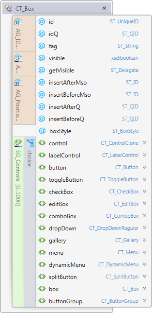
rxBox models element CT_Box of the MS Custom UI XML specification which specifies a grouping container control that aligns child controls horizontally or vertically.
Properties
Property Name
|
Description
|
| boxStyle | Specifies the alignment direction of the child controls |
| id | The ID of a custom UI element. IDs must be unique |
| idQ | A qualified control ID. Qualified IDs allow different add-ins to modify the same custom group, tab, or menu |
| insertAfterMso | The ID of a built-in control to be inserted after |
| insertAfterQ | The ID of a control to be inserted after |
| insertBeforeMso | The ID of a built-in control to be inserted before |
| insertBeforeQ | The ID of control to be inserted before |
| isEmpty | Read-only property; returns true if the control is empty |
| isLive | Read-only property; returns true if the control is live |
| parent | The control's parent object |
| visible | Whether the control is visible |
| xml | Returns the xml node that corresponds to the state of the control |
Contained Controls
Property Name
|
Description
|
| boxes | A collection of boxes |
| buttonGroups | A collection of button groups |
| buttons | A collection of buttons |
| checkBoxes | A collection of check boxes |
| comboBoxes | A collection of combo boxes |
| controls | A collection of controls that can enable, disable or clone built-in controls |
| dropDowns | A collection of drop-downs |
| dynamicMenus | A collection of dynamic menus |
| editBoxes | A collection of edit boxes |
| galleries | A collection of galleries |
| labelControls | A collection of label controls |
| menus | A collection of menus |
| ribbonXControls | The collection of all contained ribbonX controls |
| splitButtons | A collection of split-buttons |
| toggleButtons | A collection of toggle-buttons |
Methods
Method Name
|
Description
|
| clear | Clears the control's state |
| clone | Creates a clone of the control (a new id is automatically created if applicable) |
| readXml | Populates the control using the passed-in XML string |
Delegates
Delegate Name
|
Description
|
| getVisible | Callback that sets the control's visible state |
Events
Event Name
|
Description
|
| OnGetVisible | Callback that sets the control's visible state |