Difference between revisions of "RxBackstageCheckBox"
From Ribbon Commander Documentation
(→Properties) |
|||
| Line 11: | Line 11: | ||
{{DocTableEntry | name=description}} | {{DocTableEntry | name=description}} | ||
{{DocTableEntry | name=enabled}} | {{DocTableEntry | name=enabled}} | ||
| + | {{DocTableEntry | name=expand}} | ||
{{DocTableEntry | name=id}} | {{DocTableEntry | name=id}} | ||
| − | |||
{{DocTableEntry | name=idQ}} | {{DocTableEntry | name=idQ}} | ||
| − | |||
| − | |||
| − | |||
| − | |||
| − | |||
| − | |||
{{DocTableEntry | name=isEmpty}} | {{DocTableEntry | name=isEmpty}} | ||
{{DocTableEntry | name=isLive}} | {{DocTableEntry | name=isLive}} | ||
| Line 26: | Line 20: | ||
{{DocTableEntry | name=parent}} | {{DocTableEntry | name=parent}} | ||
{{DocTableEntry | name=screentip}} | {{DocTableEntry | name=screentip}} | ||
| − | |||
| − | |||
| − | |||
{{DocTableEntry | name=supertip}} | {{DocTableEntry | name=supertip}} | ||
{{DocTableEntry | name=tag}} | {{DocTableEntry | name=tag}} | ||
Latest revision as of 20:02, 11 March 2013

Contents
Description
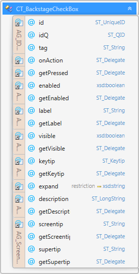
rxBackstageCheckBox models element CT_BackstageCheckBox of the MS Custom UI XML specification which specifies a backstage check box control.
Properties
Property Name
|
Description
|
| description | Sets the extended description of the control, which appears in menus with itemSize set to large |
| enabled | Whether the controls is enabled |
| expand | Specifies the directions in which the control expands to fill its parent container. |
| id | The ID of a custom UI element. IDs must be unique |
| idQ | A qualified control ID. Qualified IDs allow different add-ins to modify the same custom group, tab, or menu |
| isEmpty | Read-only property; returns true if the control is empty |
| isLive | Read-only property; returns true if the control is live |
| keytip | Sets the control's keytip |
| label | Sets the control's label |
| parent | The control's parent object |
| screentip | Sets the screentip, which appears on mouse hover |
| supertip | Sets the control's supertip, a large screentip |
| tag | Custom data |
| visible | Whether the control is visible |
| xml | Returns the xml node that corresponds to the state of the control |
Methods
Method Name
|
Description
|
| clear | Clears the control's state |
| clone | Creates a clone of the control (a new id is automatically created if applicable) |
| readXml | Populates the control using the passed-in XML string |
Delegates
Delegate Name
|
Description
|
| getDescription | Callback that sets the control's description |
| getEnabled | Callback that sets the control's enabled state |
| getKeytip | Callback that sets the keytip |
| getLabel | Callback that sets the label |
| getPressed | Callback that determines whether the control is in the 'pressed' state when first rendered/invalidated |
| getScreentip | Callback that sets the screentip |
| getSupertip | Callback that sets the supertip, a large screentip |
| getVisible | Callback that sets the control's visible state |
Events
Event Name
|
Description
|
| OnActionEvent | Callback fired on user action |
| OnGetDescription | Callback that sets the control's description |
| OnGetEnabled | Callback that sets the control's enabled state |
| OnGetKeytip | Callback that sets the keytip |
| OnGetLabel | Callback that sets the label |
| OnGetPressed | Callback that determines whether the control is in the 'pressed' state when first rendered/invalidated |
| OnGetScreentip | Callback that sets the screentip |
| OnGetSupertip | Callback that sets the supertip, a large screentip |
| OnGetVisible | Callback that sets the control's visible state |