Difference between revisions of "RxButton"
(→Properties) |
(→Properties) |
||
| Line 8: | Line 8: | ||
== Properties == | == Properties == | ||
| − | {| | + | {{DocTableBegin | Col1Name=Property Name Col2Name=Description |
| − | + | ||
| − | + | ||
{{DocTableEntry | name=description}} | {{DocTableEntry | name=description}} | ||
{{DocTableEntry | name=enabled}} | {{DocTableEntry | name=enabled}} | ||
Revision as of 14:00, 11 March 2013
Contents
Description
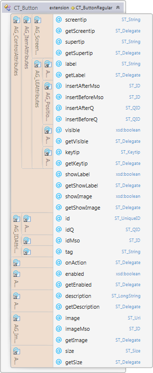
rxButton models element CT_Button of the MS Custom UI XML specification which specifies a standard push button.
Properties
{{DocTableBegin | Col1Name=Property Name Col2Name=Description |- | style="padding-left: 10px" | description || Sets the extended description of the control, which appears in menus with itemSize set to large |- | style="padding-left: 10px" | enabled || Whether the controls is enabled |- | style="padding-left: 10px" | id || The ID of a custom UI element. IDs must be unique |- | style="padding-left: 10px" | idMso || The ID of a built-in control |- | style="padding-left: 10px" | idQ || A qualified control ID. Qualified IDs allow different add-ins to modify the same custom group, tab, or menu |- | style="padding-left: 10px" | image || A custom image or icon |- | style="padding-left: 10px" | imageMso || The image of a built-in control |- | style="padding-left: 10px" | insertAfterMso || The ID of a built-in control to be inserted after |- | style="padding-left: 10px" | insertAfterQ || The ID of a control to be inserted after |- | style="padding-left: 10px" | insertBeforeMso || The ID of a built-in control to be inserted before |- | style="padding-left: 10px" | insertBeforeQ || The ID of control to be inserted before |- | style="padding-left: 10px" | isEmpty || Read-only property; returns true if the control is empty |- | style="padding-left: 10px" | isLive || Read-only property; returns true if the control is live |- | style="padding-left: 10px" | keytip || Sets the control's keytip |- | style="padding-left: 10px" | label || Sets the control's label |- | style="padding-left: 10px" | parent || The control's parent object |- | style="padding-left: 10px" | screentip || Sets the screentip, which appears on mouse hover |- | style="padding-left: 10px" | showImage || Whether to show a control's image |- | style="padding-left: 10px" | showLabel || Whether to show a control's label |- | style="padding-left: 10px" | size || The control's size |- | style="padding-left: 10px" | supertip || Sets the control's supertip, a large screentip |- | style="padding-left: 10px" | tag || Custom data |- | style="padding-left: 10px" | visible || Whether the control is visible |- | style="padding-left: 10px" | xml || Returns the xml node that corresponds to the state of the control |}
Methods
Method Name
|
Description
|
| clear | Clears the control's state |
| clone | Creates a clone of the control (a new id is automatically created if applicable) |
| readXml | Populates the control using the passed-in XML string |
Delegates
Delegate Name
|
Description
|
| getDescription | Callback that sets the control's description |
| getEnabled | Callback that sets the control's enabled state |
| getImage | Callback for a custom image |
| getKeytip | Callback that sets the keytip |
| getLabel | Callback that sets the label |
| getScreentip | Callback that sets the screentip |
| getShowImage | Callback for whether to show the control's image |
| getShowLabel | Callback for whether to show the control's label |
| getSize | Callback for the control's size |
| getSupertip | Callback that sets the supertip, a large screentip |
| getVisible | Callback that sets the control's visible state |
| onAction | Callback fired on user action |
Events
Event Name
|
Description
|
| OnActionEvent | Callback fired on user action |
| OnGetDescription | Callback that sets the control's description |
| OnGetEnabled | Callback that sets the control's enabled state |
| OnGetImage | Callback for a custom image |
| OnGetKeytip | Callback that sets the keytip |
| OnGetLabel | Callback that sets the label |
| OnGetScreentip | Callback that sets the screentip |
| OnGetShowImage | Callback for whether to show the control's image |
| OnGetShowLabel | Callback for whether to show the control's label |
| OnGetSize | Callback for the control's size |
| OnGetSupertip | Callback that sets the supertip, a large screentip |
| OnGetVisible | Callback that sets the control's visible state |
Remarks
Examples
VBA
Dim grp As rxGroup
Set grp = New rxGroup

Dim btn As rxButton
Set btn = New rxButton

grp.Buttons.Add btn